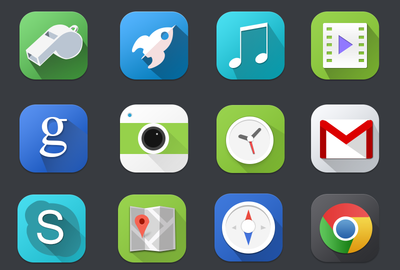
set_1x-400x270

Flat Icons Freebie

Author: kaizoro Tags: , License: WTFPL Download Pack

Grab the PSD! Here are 6 more icon from Premium Flat icons.

  • juststeven

    This icon set is great. Another set that seems to look ‘fun’. These would look divine as application buttons for a phone or tablet. And I like the diagonal drop shadows on these icons that make it look like it’s beaming down. Although on the Skype icon it seems a bit to prominent. Great choice of gradients and colour and the camera icon is well-thought out. Kudos to the designer.

  • Brad

    I like them all apart from the skype one. Not really a big fan of the shadow behind the S. Apart from that, they’re great.

  • Rick_Ace

    The Skype icon does look out of place. Perhaps, it was never meant to be flat.The Chrome icon has a weird shade to it too. But the other icons work well. The Google icon makes up for the other flat icons. It looks quite similar to the actual google logo. Great work kaizoro!